Finnish Design Shop is a Turku-based online shop selling Nordic and Scandinavian designer brands shipping globally to 180 countries. It has 63 employees, but no dedicated UX staff and therefore no formal usability evaluation apart from A/B has been conducted on it prior to our project. That was the aim of our Usability Evaluation course. This time I worked with Carolina Diess, Maggie Mishinova and Mario López Batres.
We started by having a meeting a client representative with Pekka Partanen, our contact at the Finnish Design Shop. We discussed his wishes & expectations together with the course requirements we compiled those into a research plan.
The research questions that we defined are intended to cover all three aspects of usability (efficiency, effectiveness and satisfaction):
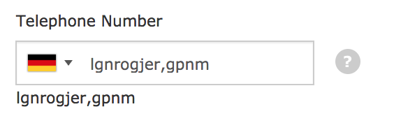
- RQ: Is the cost of shipping communicated clearly?
- RQ: How easily can I find a product meeting my expectations?
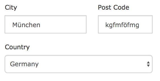
- RQ: What are the problems within the checkout process?
Expert evaluation
First we performed the expert evaluation by conducting the Heuristic evaluations following the Nielsen’s 10 Usability Heuristics and the Cognitive walkthroughs for 3 scenarios, which were selected due to their importance after discussing with the client:
- Finding pricing of the shipment to home country
- Searching for a product meeting my expectations
- Checkout process
Since we were examining both desktop and mobile, we split into two groups, one starting on mobile and the other on desktop. The aim of this was not to be primed by looking for the same issues in the other platform.
For Heuristic evaluation on desktop we used the UX Check Tool, a Chrome extension which I can recommend as it allows the finding to be easily exported. Each problem was rated based on its severity on a scale of 1 (Cosmetic - nice to fix) to 4 (Catastrophic - must be fixed). We documented the Congnitive walkthroughs in a shared excel sheet outlining the invididual steps of each scenario and the 2 questions of the streamlined cognitive walkthrough method.
These were supplemented methods by taking a look at the data in Google Analytics, done by Maggie. This gave us an insight about real customer behaviour, quantitative data and a comparison between mobile & desktop.
Once we were done with our individual evaluation we dicussed them at a team meeting and selected the most important ones for the first report.
Empirical testing
After identifying a vast selection of problems during the expert evaluation, we had to narrow down our research questions in order to look for more specific problems. For the empirical testing we decided to focus on mobile only, as that was the platfrom that was a priority for our client.
The we proceeded by specifying tasks and scenarios for the empirical evaluations. We scheduled a session at the Aalto Usability lab and started looking for users that would fit the customer profile of the Finnish Design Shop. Most of their customers are located abroad. United States, Japan, Australia, Canada and the United Kingdom are their largest markets. The main age group of buyers is 25-35 years old and majority of them are women. Given the access to a large international community at Aalto we aimed to recruit users with similar demographic characteristics.
We arrived to the usability lab way in advance of the first invited user in order to familiarize ourselves with the equipment, prepare all resources and run a quick trial. Audio from each session was recorded as well screen of the mobile phone. We connected the mobile phone to a laptop and shared its screen with another laptop in the observation room. This setup is very simple, yet efficient and does not require any additional equipment. We ended up not needing any of the camera present in the usability lab.
Once the first user arrived and signed the required paperwork, we proceeded with giving them 3 tasks, one corresponding to each research question. The task was explained both verbally and written down on a piece of paper given to the participant. After they were done with the task, we asked them to fill out the VisAWI-S questionnaire (Visual Aesthetics of Websites Inventory - Short version) to asses the visual attractivenes of the websites. To conclude we had a short semi-structured interview with each user focusing on their shopping behaviour and general impressions from the webshop.
“Feels professional, but not premium.” - Participant quote
Throughout the day we rotated the role of moderating the session with the user while the other 3 were observing from the other room and taking notes. We had enough time in between the sessions to discuss them right away.
At the end of the course we compiled our findings from the previous two reports into a final one explaining our process and provided examples of problems that we have identified. We also gave recommendations on how some of the issues could be fixed.
“Thanks for the final report and the usability study as a whole! The findings are very valuable and some of them are really eye-opening.” - Pekka Partanen from the Finnish Design Shop
Usability evaluation is a nuanced discipline that requires attention to detail and a clear focus. This is most apparent by framing the research questions that we are trying to answer. The choice of methods is also hugely important, as their triangulation allows us to validate the identified issues.